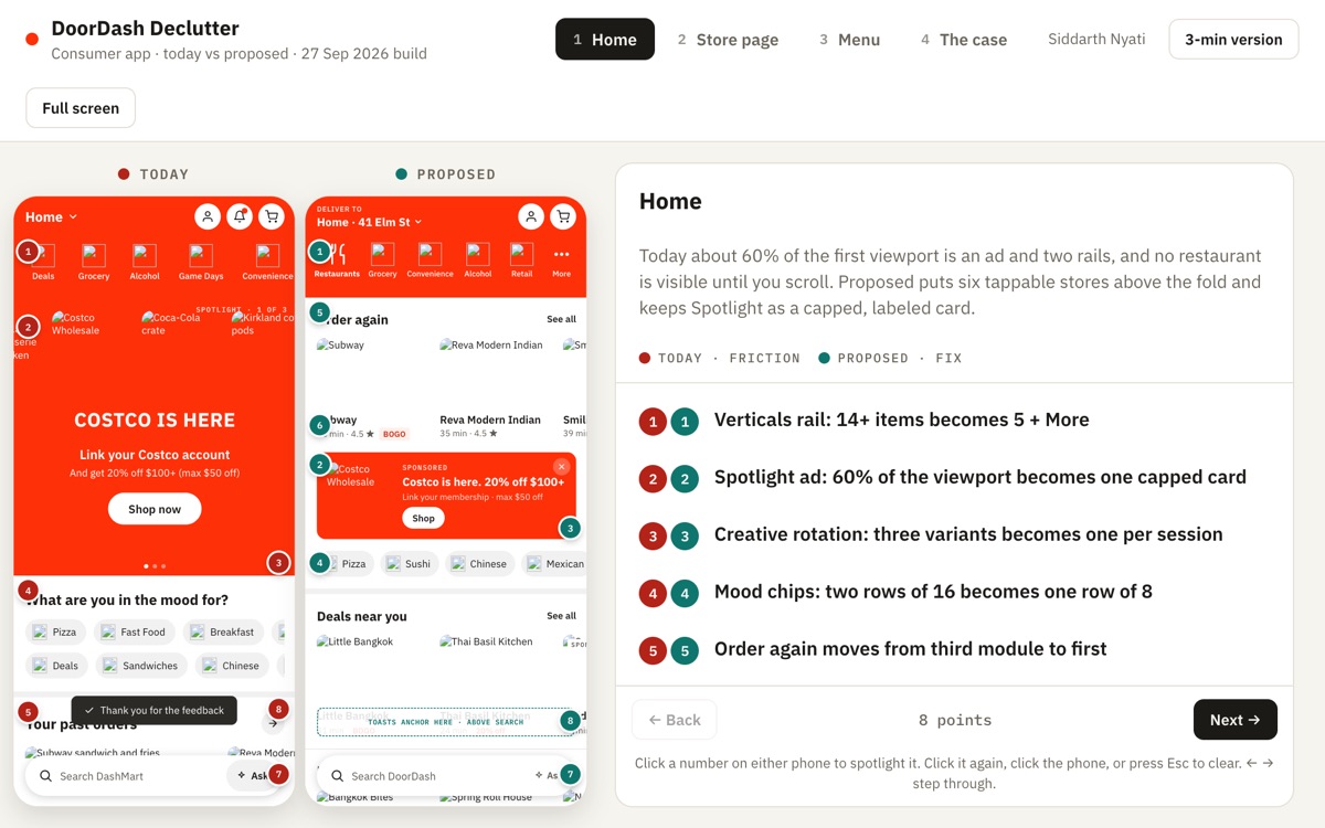
About 60% of the first viewport of a leading food-delivery app is an ad and two rails; no restaurant is visible until you scroll. Removing the ads would cost real revenue, so the question is how to keep the units and lose the noise around them.
What I proposed
Home: six tappable stores above the fold, the sponsored unit kept as one capped, labelled card.
Store and menu: fewer rails, one creative per session, search where it belongs.
Guardrails: an A/B plan with ad revenue as a guardrail metric, not an afterthought.
What I would flag
An independent critique of a public app, not affiliated with the company. Screens are redrawn from the live product.